As a continuation of one of my previous posts ‘color: hues, shades and tint’, today I’ll be saying something more about colors.
Colors and Schemes
When it comes to choosing proper colors I have found myself in tight corners many a times. Colors have a life of their own. They have friends and foes. Some gels very well with other, while some never. What goes well with a theme and how, I have to think about it more too often. But when I’m too confused I stick to the neutrals white or black.
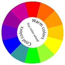
The first thing we are taught about colors is probably the color-wheel. While you may have seen one in your school life but you might not have given much thought to it then. The color wheel is a simple device for understanding colors in relation to one another. This circle is based on three primary colors namely red, yellow and blue.
There are further classifications such as secondary and tertiary colors. As shown here, secondary colors consist of violet, orange and green. These colors are obtained by mixing the primary colors. Tertiary colors are for example reddish-orange, yellowish-orange, yellowish-green, bluish-green, bluish-violet and reddish-violet. These are obtained when mixing one secondary and one primary color in equal proportions.

Another classification is of complementary colors. These are positioned opposite to each other on the color wheel. Designers or anybody who have to deal with colors frequently refer to these classifications so as to decide upon a suitable color-scheme for their work.
Talking about colors, I have changed the colors of my blog too. It's now sporting analogous color scheme of green and blue. Analogous colors are those which are placed close to each other on the color wheel. Hope you noticed it! If you've visited my blog a few weeks ago you might have seen rather dull looking colors. Since I intended to give a refreshing look I chose this present scheme. It is not a new combination. A popular site like StubleUpon is also using this. But the main difference here is the use of white background in entirety to give a clean and simple feel.
Recently I have read a well written article on choosing color combinations on Veerle’s blog. She has some really good tips on it explained in a lucid manner.
Google a bit and you can find plenty of useful links other than those given here.
How do you choose your color scheme? Share your views in the comment box.
I would be glad to read them!


No comments:
Post a Comment