 This is the second part of my series of posts on ‘Color matters in Design’. In my previous post I wrote about colors in general and how a different color scheme changed the look and feel of my blog. Today I’ll be writing something about…what colors mean to us .
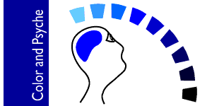
Influences of color
I have found that mood plays an important role in color selection in any work of art. Every finished piece of design is intended to create some sort of mood, which finally elicits a response from the viewers. This in itself says a lot about the psychological influence of color.
Have you noticed that your online experience varies according to the kind of color used in a blog or a website? Let me tell you a personal example. I feel more positive, attentive, composed and responsive when I visit sites which use tints and shades of blue. It gives a nice cool feel. Observe some sites and blogs which I visit regularly or more often: StopDesign, Wikipedia, Orkut, David Airey’s blog, Daily Blog Tips, etc. They all are using blue color in some way or the other. So personally, I feel inclined to visit such sites which not only fulfill my need for info but which also make my eyes feel comfortable.
This is not just a case of mine. I’m sure you too have felt the same some time or the other. The power of colors is acknowledged by science. In fact there is a branch called Color Psychology which administers color therapy! While designers do not use color for therapeutic purposes, they do use it to induce a desired response through the graphics.
Several studies have been made to understand which colors induce which kind of feelings? Let’s see the effects of the primary colors red, yellow and blue in pure hue. The feelings conveyed by these are as per my observation and are basic psychological conditions.
Red: It evokes strong and intense emotions. Exudes warmth by nature. Arouses the senses.
Yellow: Conveys cheerfulness energy and fun. But is very intense in pure form. Can cause fatigue if it's too much.
Blue: Peaceful, calm and symbolizes intellect. Overuse can lead to a feeling of hopelessnes and gloom.
Our color palette is not limited to red, yellow and blue. When two these colors mix they produce not just secondary colors but also result in a mix of feelings depending on the domination of one of the colors. Colors are also formed when they are mixed with a neutral color like black or white. An old post of mine Hues, Shades and Tints describes about this in more length.
It really pays to know about these things when you have to decide a color scheme. Especially if one is working on a new logo or a campaign for a new company or product. Giving a deep thought on the color aspect of design in relation to the target audience is not only beneficial but is a must.
How do you respond to a color? Share you views in the comment box.


No comments:
Post a Comment