Showing posts with label Color. Show all posts

Wednesday, 26 December 2007

Color matters in design – Part III

This is the third part of my series of posts on Color matters in Design. In my previous posts I wrote about colors in general, how through a different color scheme I changed the look and feel of my blog and how colors affect our behavior. Today Ill be sharing some info about color management and color modes on computer.

Color spaces of various devices

Color matching woes

I remember the first time when I used a professional graphic application. It was two years back when I enrolled for a course in multimedia. My Faculty introduced to the whole class the ultimate image editing software called Photoshop. She taught us how to create a new document, how to choose a size, set the resolution and color mode. But never did she touch the topic of color management. It was not until after a year had passed that I came to face the result of improperly color managed document. Precisely speaking it was when our group took our project work to printing and found the results to be a very different than expected! The colors were so dull and lifeless.

The need for Color Managed Documents

Color management is the process of reproducing colors in a similar way irrespective of the devices used to create, display and print them. In simple words let me illustrate a situation. you take a picture from your digital camera, transfer it to your system and create something with it on using a specific application; you take it to a friend of yours and see that on his/her system and find that the colors in the document are not the same one you had on yours; you rectify and bring out some changes in the document and take it to you service bureau to print them; and when you finally get the output you find it to be even more different! Why so? Why didnt the colors of your document match? It is because for three reasons:

  1. The color profile of the camera (an input device) is different from your monitor.
  2. The default color profile of your monitor and your friends were not the same.
  3. Before creating the document you didnt ask your service bureau what color profile they are using and so you didnt choose the proper color profile in your graphic application.

The color profiles

Color management starts with choosing a standard color profile for your system and the applications you are running. The color matching problems result because various devices and softwares have their different color spaces.

Now lets see what a color space is. Devices see colors much differently than a human eye. In fact human eyes are perceptive to much-much broader range of colors than electronic devices. A color space thus defines the range of colors within a color mode. One should consider seriously the out of gamut warnings in the color palette to avoid mismatched colors while working on documents for print.Choosing in gamut colors


Color mode is nothing but a bunch of values and their inter relationships used to represent a color. There are two major color modes, RGB -- which is suitable for all on-screen displays and CMYK -- basically associated with four color process printing. So a color mode determines the range of color (or the color space in technical terms) that a device can produce. Quite technical eh! No need to scratch you head, there is a solution to all this color matching fuss.

The ICC color profile

To overcome this situation and to produce device-independent consistent color output a Color Management System (CMS) is used. What it does? A CMS lets you specify and translate colors using a standard color profile. There are many color profiles out there. But the first one that comes to mind is the ICC color profile.

ICC is an Industry consortium founded in 1993. It stands for International Color Consortium. ICC was formed by a group of industry vendors namely Adobe Systems Incorporated, Agfa-Gevaert N.V., Apple Computer, Inc., Eastman Kodak Company, FOGRA-Institute (Honorary), Microsoft Corporation, Silicon Graphics Inc., Sun Microsystems, Inc. and Taligent, Inc.

saving a photoshop document with ICC color option

Very big names indeed! The ICC has developed and is promoting a standard color profile specification known as the ICC color profile. It is an open, vendor-neutral and cross-platform profile. While saving your documents be sure to select the ICC color profile in the options dialogue box for a color managed document.

Have you thought about color management before? If yes, Id be glad to know how you did it. Do share your views in the comment box.

Saturday, 15 December 2007

Color matters in design – Part II

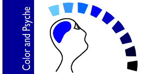
The pshychology of colorThis is the second part of my series of posts on Color matters in Design. In my previous post I wrote about colors in general and how a different color scheme changed the look and feel of my blog. Today Ill be writing something aboutwhat colors mean to us .
Influences of color

I have found that mood plays an important role in color selection in any work of art. Every finished piece of design is intended to create some sort of mood, which finally elicits a response from the viewers. This in itself says a lot about the psychological influence of color.

Have you noticed that your online experience varies according to the kind of color used in a blog or a website? Let me tell you a personal example. I feel more positive, attentive, composed and responsive when I visit sites which use tints and shades of blue. It gives a nice cool feel. Observe some sites and blogs which I visit regularly or more often: StopDesign, Wikipedia, Orkut, David Aireys blog, Daily Blog Tips, etc. They all are using blue color in some way or the other. So personally, I feel inclined to visit such sites which not only fulfill my need for info but which also make my eyes feel comfortable.

This is not just a case of mine. Im sure you too have felt the same some time or the other. The power of colors is acknowledged by science. In fact there is a branch called Color Psychology which administers color therapy! While designers do not use color for therapeutic purposes, they do use it to induce a desired response through the graphics.

Several studies have been made to understand which colors induce which kind of feelings? Lets see the effects of the primary colors red, yellow and blue in pure hue. The feelings conveyed by these are as per my observation and are basic psychological conditions.

Red: It evokes strong and intense emotions. Exudes warmth by nature. Arouses the senses.

Yellow: Conveys cheerfulness energy and fun. But is very intense in pure form. Can cause fatigue if it's too much.

Blue: Peaceful, calm and symbolizes intellect. Overuse can lead to a feeling of hopelessnes and gloom.

Our color palette is not limited to red, yellow and blue. When two these colors mix they produce not just secondary colors but also result in a mix of feelings depending on the domination of one of the colors. Colors are also formed when they are mixed with a neutral color like black or white. An old post of mine Hues, Shades and Tints describes about this in more length.

It really pays to know about these things when you have to decide a color scheme. Especially if one is working on a new logo or a campaign for a new company or product. Giving a deep thought on the color aspect of design in relation to the target audience is not only beneficial but is a must.

How do you respond to a color? Share you views in the comment box.

Saturday, 8 December 2007

Color matters in design - Part I

 the color wheel

As a continuation of one of my previous posts color: hues, shades and tint, today Ill be saying something more about colors.

Colors and Schemes

When it comes to choosing proper colors I have found myself in tight corners many a times. Colors have a life of their own. They have friends and foes. Some gels very well with other, while some never. What goes well with a theme and how, I have to think about it more too often. But when Im too confused I stick to the neutrals white or black.

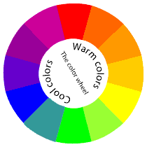
The first thing we are taught about colors is probably the color-wheel. While you may have seen one in your school life but you might not have given much thought to it then. The color wheel is a simple device for understanding colors in relation to one another. This circle is based on three primary colors namely red, yellow and blue.

There are further classifications such as secondary and tertiary colors. As shown here, secondary colors consist of violet, orange and green. These colors are obtained by mixing the primary colors. Tertiary colors are for example reddish-orange, yellowish-orange, yellowish-green, bluish-green, bluish-violet and reddish-violet. These are obtained when mixing one secondary and one primary color in equal proportions.

Primary, secondary and tertiary colors.


Another classification is of complementary colors. These are positioned opposite to each other on the color wheel. Designers or anybody who have to deal with colors frequently refer to these classifications so as to decide upon a suitable color-scheme for their work.

Talking about colors, I have changed the colors of my blog too. It's now sporting analogous color scheme of green and blue. Analogous colors are those which are placed close to each other on the color wheel. Hope you noticed it! If you've visited my blog a few weeks ago you might have seen rather dull looking colors. Since I intended to give a refreshing look I chose this present scheme. It is not a new combination. A popular site like StubleUpon is also using this. But the main difference here is the use of white background in entirety to give a clean and simple feel.

Recently I have read a well written article on choosing color combinations on Veerles blog. She has some really good tips on it explained in a lucid manner.

Google a bit and you can find plenty of useful links other than those given here.

How do you choose your color scheme? Share your views in the comment box.
I would be glad to read them!


Saturday, 18 August 2007

Color: Hues, Shades and Tint


Continuing with the topic, I’d like to warn you that there are no hard and fast rules in deciding which colors to use. But one thing that you should always bear in mind is – the context. If the context is sad the colors need to be dull. Bright colors go well with happier and joyful themes.

Besides context, the medium is also important. Since the colors that you may use for a brochure for print might not get reproduced the same way on a website. That’s the basic difference. Print colors are based on ink pigments whereas on-screen colors result from light.

While working on color combinations you can choose from a wide array of Hues, Shades and Tints. People generally get confused with these terms and often interchange these in meaning. In any graphic design application colors are identified by a value ranging from 0 to 255.Here 0 stands for black and 255 for white. Add to that channels of different color modes. Basically two color modes are used. RGB (Red, Green, Blue) is used for onscreen production and CMYK (Cyan, Magenta, yellow, Black. K stand for krypton = black) for print. Each channel has different color value which results in a final color. Confusing? Don’t bother. It’s quite easy. Say we want to get yellow color in RGB color mode if you type a value of :

R + G + B = Yellow

255 + 255 + 0 = Yellow


Hue

Hue is nothing but pure form of a color. You remember VIBGYOR? The ray of light which gets refracted shows a rainbow. These are pure color values at maximum chrome. They don’t have any value of gray in it. This basic rainbow is actually the color spectrum ranging from red to violet. It has all the colors that our eyes can detect.


Shade

When black is mixed with a color value it is called as a shade. So maroon is the shade of red + black.


Tint

We get tint by mixing white with a pure color. So sky blue is obtained as a result of blue + white.


Black and white

There are about 8000 colors and their variations inexistence. Most of them are basically based on either black or white. In pure form black and white are not generally included in the list of colors. They are Neutrals. But their use should be done judiciously.

Black expresses depth, secrecy, seriousness, mystery and awe. It’s not a surprise then to see a lot of CG artists using black as a prominent background color. Things like Glassy buttons and white text look fabulous on a black background.

White on the other hand is opposite of it. It exudes purity, richness, vastness, peace and holiness. If you have no idea what to use as background color, stick to white. I’ve been seeing a lot of white backgrounds on the hoardings and billboards these days. The main advantage is its power to grab attention. Any one who stops at a signal can’t stop staring at a vast white board which crops up from within the clutter of buildings and dark green trees. But be sure leave a lot of space around the objects in picture.

Tuesday, 14 August 2007

Color: What is it?

ALIVE! That’s what best describes the word color. And you won’t deny it either that life would be so boring, dull and ‘life less’ without colors. One of the first things we encounter through our eyes is ‘color’ and it impacts our mind in many ways.

Color is one of the most important elements of design. Lots of people studied it in depth. There are color theories, models, classifications and characteristics. But what would be most important to any body dealing with colors in their work of art is – How best to use them? To know that we must have an idea about things that colors do in a design.

  • Color is a key ingredient that makes design (for matter of fact - all objects) very appealing, attractive and a pleasurable experience.
  • Colors create moods. They generate some kind of feeling in the viewer.
  • Colors make the presentation realistic or ‘alive’.

Theories of course help us a lot to analyze colors in different ways. So here, I try to research info about colors and put forth things which are worthwhile to know so that you can apply them in your work whenever needed.